UI Design
UI Design
UI Design
Functional Art: 10 Big Reasons to Apply Illustrations in UI Design
Functional Art: 10 Big Reasons to Apply Illustrations in UI Design
Functional Art: 10 Big Reasons to Apply Illustrations in UI Design

• Marina Yalanska
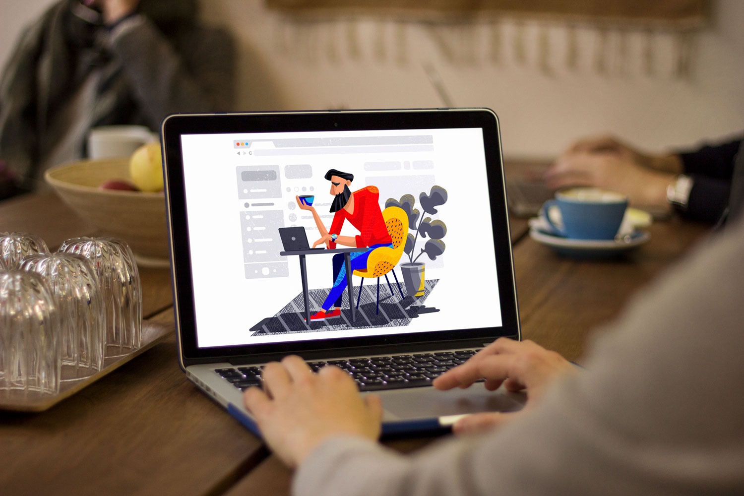


For the last couple of years, original illustrations for user interfaces have been one of the most popular and solid design trends. Let’s discuss the reasons that make designers choose illustrations among the core visual elements of UI design for websites and mobile applications.
What Is Illustration?
Basically, illustration is a visual interpretation of a particular concept, text or process. It’s an image that aims at supporting, clarifying or even extending the ideas that people get from the other source of information, most often given in the form of the text. The word itself means “throwing light on something” so its main purpose is to help the viewer understand or imagine something better.
Through the years, illustrations have been integrated into diverse print stuff like books, magazines, newspapers, posters, flyers, educational materials. Later, the field got a new breath with cartoons and video production. And quite recently, new technologies and tools pushed the limits opening the time of digital illustration.
Due to its beauty and creative flexibility, illustration rockets with a constantly growing number of websites and mobile apps as one of the ways to enhance usability, emotional and visual appeal of the interface. But what are the functions which can be covered with illustrations in UI design?

Ways to Use Illustration in User Interfaces
As well as any other part of an interface, illustration is a functional element rather than decoration. It should make the message and interactions easier and clearer – and more stylish, sure, why not? We can come across UI illustrations in:
theme images
mascots and characters
onboarding tutorials and tooltips
rewards and other gamification graphics
notifications and system messages
stickers (especially popular for messenger apps)
storytelling
infographics
marketing stuff and advertising banners
visual markers of content categories
social network pages supporting the website or app.
Here are the top ten reasons why illustrations got so much popularity in interface design – and perhaps why you would consider using them in your next design project.
10 Reasons to Add Illustration to User Interfaces
1. Custom illustrations establish the solid foundation of originality and artistic harmony
Graphics add a pinch of style and creativity to an interface, printed item, or branded stuff. In the world of tight competition, it’s vital to stand out. Otherwise, people may not even try your product let alone understanding its benefits.
By the way, that’s the reason why many companies use illustrations as hero images for their blog articles, review, and landing pages. In this case, designers can fine-tune the artworks taking into account the target audience’s preferences, and balance them with business goals or ideas behind a particular project or theme. That allows for finding interesting metaphors, color schemes, characters, and an environment that would appeal effectively to the specific pool of readers or viewers.
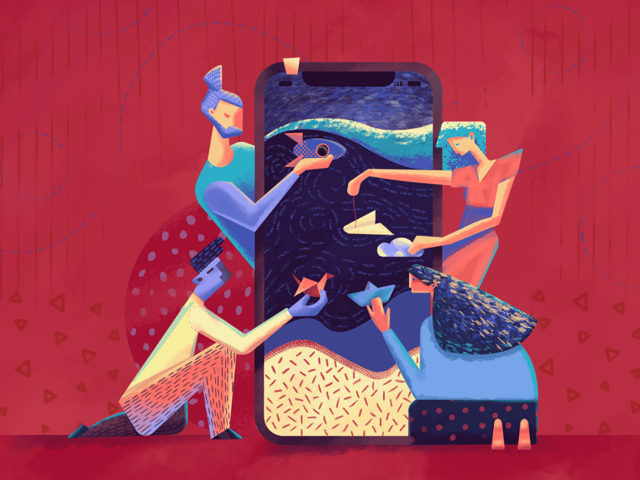
Look at the metaphoric title illustration of the article about UI animation. The smartphone plays the role of a curtain wall or screen, like the one used in a puppet theatre and designers reflect actors each of which shows a specific model of motion performance.
2. Illustration creates visual triggers that quickly transfer the necessary message
The vast majority of people perceive images faster than words. That’s neither good nor bad, it’s just a fact that designers can use to increase the visual performance of web or mobile layouts. People, in general, have incredibly broad abilities to perceive visual marks, recognize and proceed data even transformed in images of a high level of abstraction.
Here’s a bunch of useful facts:
as psychologists claim, people need about 1/10 of a second to get a general perception of a visual scene or element (that speed is indeed impossible for textual items)
visuals are transmitted to the brain much faster and important pieces of information are often fixed by the brain as visual images even if they were obtained via text perception
images are less vulnerable in combination with the background and surrounding elements while the text is highly dependent on the aspect of readability
images have a tendency to stick better in long-term memory which means that dealing with the interface users will not need to process and remember more data than it’s really necessary, so interactions get faster
visuals in the interface can make it more universal in cases when an app or a website is used by people from different countries
pictures push the limits of perception for users who have natural problems with text recognition such as, for instance, the dyslexic or non-reading preschoolers.
All the above-mentioned builds a solid reason to create strong and fast visual associations with illustrations. Characters, colors, composition, recognizable details will quickly inform users and support the message given in the textual form.
For the last couple of years, original illustrations for user interfaces have been one of the most popular and solid design trends. Let’s discuss the reasons that make designers choose illustrations among the core visual elements of UI design for websites and mobile applications.
What Is Illustration?
Basically, illustration is a visual interpretation of a particular concept, text or process. It’s an image that aims at supporting, clarifying or even extending the ideas that people get from the other source of information, most often given in the form of the text. The word itself means “throwing light on something” so its main purpose is to help the viewer understand or imagine something better.
Through the years, illustrations have been integrated into diverse print stuff like books, magazines, newspapers, posters, flyers, educational materials. Later, the field got a new breath with cartoons and video production. And quite recently, new technologies and tools pushed the limits opening the time of digital illustration.
Due to its beauty and creative flexibility, illustration rockets with a constantly growing number of websites and mobile apps as one of the ways to enhance usability, emotional and visual appeal of the interface. But what are the functions which can be covered with illustrations in UI design?

Ways to Use Illustration in User Interfaces
As well as any other part of an interface, illustration is a functional element rather than decoration. It should make the message and interactions easier and clearer – and more stylish, sure, why not? We can come across UI illustrations in:
theme images
mascots and characters
onboarding tutorials and tooltips
rewards and other gamification graphics
notifications and system messages
stickers (especially popular for messenger apps)
storytelling
infographics
marketing stuff and advertising banners
visual markers of content categories
social network pages supporting the website or app.
Here are the top ten reasons why illustrations got so much popularity in interface design – and perhaps why you would consider using them in your next design project.

10 Reasons to Add Illustration to User Interfaces
1. Custom illustrations establish the solid foundation of originality and artistic harmony
Graphics add a pinch of style and creativity to an interface, printed item, or branded stuff. In the world of tight competition, it’s vital to stand out. Otherwise, people may not even try your product let alone understanding its benefits.
By the way, that’s the reason why many companies use illustrations as hero images for their blog articles, review, and landing pages. In this case, designers can fine-tune the artworks taking into account the target audience’s preferences, and balance them with business goals or ideas behind a particular project or theme. That allows for finding interesting metaphors, color schemes, characters, and an environment that would appeal effectively to the specific pool of readers or viewers.

Look at the metaphoric title illustration of the article about UI animation. The smartphone plays the role of a curtain wall or screen, like the one used in a puppet theatre and designers reflect actors each of which shows a specific model of motion performance.
2. Illustration creates visual triggers that quickly transfer the necessary message
The vast majority of people perceive images faster than words. That’s neither good nor bad, it’s just a fact that designers can use to increase the visual performance of web or mobile layouts. People, in general, have incredibly broad abilities to perceive visual marks, recognize and proceed data even transformed in images of a high level of abstraction.
Here’s a bunch of useful facts:
as psychologists claim, people need about 1/10 of a second to get a general perception of a visual scene or element (that speed is indeed impossible for textual items)
visuals are transmitted to the brain much faster and important pieces of information are often fixed by the brain as visual images even if they were obtained via text perception
images are less vulnerable in combination with the background and surrounding elements while the text is highly dependent on the aspect of readability
images have a tendency to stick better in long-term memory which means that dealing with the interface users will not need to process and remember more data than it’s really necessary, so interactions get faster
visuals in the interface can make it more universal in cases when an app or a website is used by people from different countries
pictures push the limits of perception for users who have natural problems with text recognition such as, for instance, the dyslexic or non-reading preschoolers.
All the above-mentioned builds a solid reason to create strong and fast visual associations with illustrations. Characters, colors, composition, recognizable details will quickly inform users and support the message given in the textual form.
For the last couple of years, original illustrations for user interfaces have been one of the most popular and solid design trends. Let’s discuss the reasons that make designers choose illustrations among the core visual elements of UI design for websites and mobile applications.
What Is Illustration?
Basically, illustration is a visual interpretation of a particular concept, text or process. It’s an image that aims at supporting, clarifying or even extending the ideas that people get from the other source of information, most often given in the form of the text. The word itself means “throwing light on something” so its main purpose is to help the viewer understand or imagine something better.
Through the years, illustrations have been integrated into diverse print stuff like books, magazines, newspapers, posters, flyers, educational materials. Later, the field got a new breath with cartoons and video production. And quite recently, new technologies and tools pushed the limits opening the time of digital illustration.
Due to its beauty and creative flexibility, illustration rockets with a constantly growing number of websites and mobile apps as one of the ways to enhance usability, emotional and visual appeal of the interface. But what are the functions which can be covered with illustrations in UI design?

Ways to Use Illustration in User Interfaces
As well as any other part of an interface, illustration is a functional element rather than decoration. It should make the message and interactions easier and clearer – and more stylish, sure, why not? We can come across UI illustrations in:
theme images
mascots and characters
onboarding tutorials and tooltips
rewards and other gamification graphics
notifications and system messages
stickers (especially popular for messenger apps)
storytelling
infographics
marketing stuff and advertising banners
visual markers of content categories
social network pages supporting the website or app.
Here are the top ten reasons why illustrations got so much popularity in interface design – and perhaps why you would consider using them in your next design project.

10 Reasons to Add Illustration to User Interfaces
1. Custom illustrations establish the solid foundation of originality and artistic harmony
Graphics add a pinch of style and creativity to an interface, printed item, or branded stuff. In the world of tight competition, it’s vital to stand out. Otherwise, people may not even try your product let alone understanding its benefits.
By the way, that’s the reason why many companies use illustrations as hero images for their blog articles, review, and landing pages. In this case, designers can fine-tune the artworks taking into account the target audience’s preferences, and balance them with business goals or ideas behind a particular project or theme. That allows for finding interesting metaphors, color schemes, characters, and an environment that would appeal effectively to the specific pool of readers or viewers.

Look at the metaphoric title illustration of the article about UI animation. The smartphone plays the role of a curtain wall or screen, like the one used in a puppet theatre and designers reflect actors each of which shows a specific model of motion performance.
2. Illustration creates visual triggers that quickly transfer the necessary message
The vast majority of people perceive images faster than words. That’s neither good nor bad, it’s just a fact that designers can use to increase the visual performance of web or mobile layouts. People, in general, have incredibly broad abilities to perceive visual marks, recognize and proceed data even transformed in images of a high level of abstraction.
Here’s a bunch of useful facts:
as psychologists claim, people need about 1/10 of a second to get a general perception of a visual scene or element (that speed is indeed impossible for textual items)
visuals are transmitted to the brain much faster and important pieces of information are often fixed by the brain as visual images even if they were obtained via text perception
images are less vulnerable in combination with the background and surrounding elements while the text is highly dependent on the aspect of readability
images have a tendency to stick better in long-term memory which means that dealing with the interface users will not need to process and remember more data than it’s really necessary, so interactions get faster
visuals in the interface can make it more universal in cases when an app or a website is used by people from different countries
pictures push the limits of perception for users who have natural problems with text recognition such as, for instance, the dyslexic or non-reading preschoolers.
All the above-mentioned builds a solid reason to create strong and fast visual associations with illustrations. Characters, colors, composition, recognizable details will quickly inform users and support the message given in the textual form.
Brand Identity · Visual System · Branding · Logo Design · Social Media
·
Brand Identity · Visual System · Branding · Logo Design · Social Media
·
Brand Identity · Visual System · Branding · Logo Design · Social Media
·
Brand Identity · Visual System · Branding · Logo Design · Social Media
·
Brand Identity · Visual System · Branding · Logo Design · Social Media
·
Brand Identity · Visual System · Branding · Logo Design · Social Media
·
Brand Identity · Visual System · Branding · Logo Design · Social Media
·
Brand Identity · Visual System · Branding · Logo Design · Social Media
·
Brand Identity · Visual System · Branding · Logo Design · Social Media
·
Brand Identity · Visual System · Branding · Logo Design · Social Media
·
Brand Identity · Visual System · Branding · Logo Design · Social Media
·
Brand Identity · Visual System · Branding · Logo Design · Social Media
·
Brand Identity · Visual System · Branding · Logo Design · Social Media
·
Brand Identity · Visual System · Branding · Logo Design · Social Media
·
Brand Identity · Visual System · Branding · Logo Design · Social Media
·
Brand Identity · Visual System · Branding · Logo Design · Social Media
·
Brand Identity · Visual System · Branding · Logo Design · Social Media
·
Brand Identity · Visual System · Branding · Logo Design · Social Media
·
LET'S CONNECT
Now, let's create magic together!
Whether you have a question, a project idea, or just want to say hello, I'd love to hear from you. Reach out and let's start a conversation.